How AI-Assistants could revolutionize digital wellbeing
This article explores the potential of AI-powered, task-oriented interface design for mobile operating systems to mitigate involuntary habit forming with the goal of placing digital-agency and wellbeing back into the hands of the user; by enabling them to moderate their exposure to and their use of psychological triggers according to the “hooked” model and conceptual modeling theory.
Want to read this extensive article more easily with clickable sections and a table of contents?
Download the full pdf & Epub here and buy me a coffee in the process :)
Ideas in brief
- AI & Assistants are transforming smartphones and accelerate the rate at which digital content can be produced and consumed — What impact will this have on society’s digital wellbeing?
- Addictive design patterns, such as the Hooked model and dopamine-driven feedback loops, use psychological triggers to hijack attention and form habits unconsciously. Operating system’s UI design is conducive to this trend.
- Current digital wellbeing features fall short of preventing psychological triggers and fail to address people’s true intention by design. This leaves no-use or app blocking as the best protection against mindless use.
- A task-oriented, AI-powered interface design could help users regain control, aligning technology use with their goals and intentions.
AI Assistants are here to stay
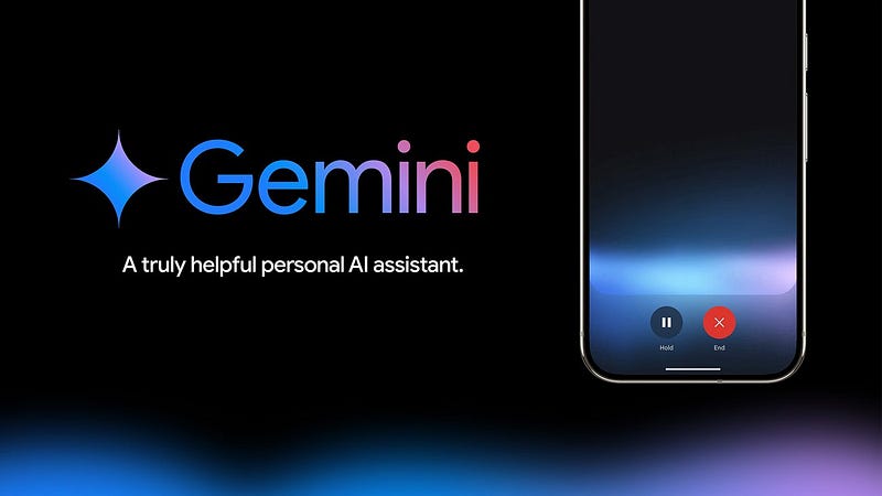
Welcome to the future! AI Calls, AI Assistants… they’re here. And that’s not just Alexa reporting the weather or playing a song. These are reasoning models that compete with each other and get better each week. With context windows increasing and app-integrations becoming more widely accessible, there is no looking back.
In some ways AI will improve our lives, make things easier and more efficient. There are also plenty of downsides and effects to be cautious of. In this article, I take my ux-designer-lense and ask the question:
What about our digital wellbeing?
How do we make sure our minds, our neurochemistry and our emotions keep up with the unprecedented pace of digital content? How do we design smart devices? And if we were to treat this topic as a design challenge:
What would an innovative and scientifically-informed solution to healthier smartphone interaction look like?
Let’s dive in.
The Age Of Indulgence (powered by AI)
Since 2020 something’s in the water
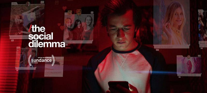
Do you remember the movie The Social Dilemma? It was released in September 2020, right around the second large covid-infection wave (in europe). A time where we all went online and social interaction in the offline world grew scarce. The Social Dilemma critizices social media, smartphones and the attention economy. In my environment it had a significant cultural impact while shining light on an important issue as I believe. But beyond this subjective take of mine, the movie was actually critically acclaimed, winning prizes and ranking high on Netflix.
Yet, (quite unfortunately-speaking) this whole humane-tech movement was at its peak during a time where social media and digital platforms provided lifelines for many. The timing makes for a contradicting history-line between the addictive and isolating pitfalls people know they’re supposed to avoid, and a global call for digital innovation in order to keep schools running, to keep the lonely connected, and to meet the consumer where they are at — online.
Today, Covid As-A-Crisis is in the past. Parks, hairdressers and cafés are in business again. More than ever, digitalization is our present and our future… AI is in full development.
In practice, machine learning models accelerate the rate at which content is generated online. Social media platforms increasingly show us viral short-form-content at the cost of our attention. This is reflected in the design layout by deprioritizing our friends’ posts and long-form-content. The stories of users we’re following take up a tiny fraction of the phone screen’s real estate - just at the top of the screen. The viral reel that all our friends liked and watched (according to the ai-powered recommender-system) takes up the most space.
It is safe to say that the “dilemma” which used to carry a touch of social is now zeroing in on our attention and on thus our dopamine . A ficitonal, rethorical Ad-slogan for Social Media on TV might be: Now with more VIRALITY and CONTROVERSY than ever, and at the HIGHEST reFresh rates known to mankind(!)

Social Media in the age of indulgence impacts our minds and our social life. Is it a coincidence that western society experiences that many mental health issues?
Research suggests that screen time exceeding 2–3 hours per day is generally associated with worse outcomes in learning, academia, and mental health
(2025 NESET report)
Agency is an important aspect of wellbeing
Allow me to preface this paragraph with a disclaimer:
Digital wellbeing is a very broad topic and investigating all factors would be its own article, if not a whole PhD research.
The center for humane technology advises consumers to “take control” with regards to their digital wellbeing. Therefore, for the sake of the vertical nature of this article’s inquiry and argumentation, I will focus on the wellbeing factor agency and the user’s perceived feeling of control. There are many other important and relevant topics (such as dopamine & motivation, filter bubbles or brain development) that need attention too.
Digital devices are tools. Humanity always liked making tools to solve problems, resulting in us advancing technology to the point we reached today.
Digital Devices are not inherently bad. However, considering our wellbeing, devices and apps can become harmful when they decrease the agency we feel over our life, our thinking and our behaviour. With the complexity of digital content in mind, digital devices can potentially induce a degenerative cycle of cause and effect in our society.
If we (consumers/users/people) do not take control, we will be at the mercy of whichever app-content is best at grabbing our attention and making us return for more. There is a huge financial incentive behind competing to do so which is why tech-companies can hire talented and skillful researchers and designers to come up with greater solutions to their challenge.
Technology is designed to hijack our agency
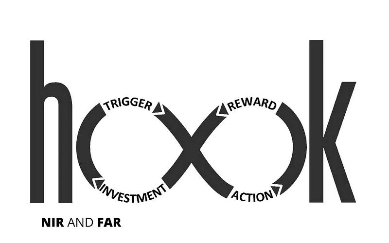
“Hooked”, a model to design habit building products
The latest and biggest tech companies reside in Silicon Valley. It is actually a region in the southern part of the San Francisco Bay Area (USA), known for its concentration of high-tech businesses.
If that iconic ‘place’ was a pilgrimage, then the Hooked model would be an ambitious tech-startup founder’s scripture.
In this section, I’ll explain the basic psychological exploits that are leveraged to design addictive apps:
(In the words of Nir Eyal, the author of the book ‘Hooked — How to build habit forming products’):
The Hooked Model is a way of describing a user’s interactions with a product as they pass through four phases:
1. a trigger to begin using the product,
2. an action to satisfy the trigger,
3. a variable reward for the action,
4. and some type of investment that, ultimately, makes the product more valuable to the user.
As the user goes through these phases, he builds habits in the process.
Extensive definition:
Trigger: The hook begins with a trigger — either external (like a notification) or internal (like boredom) — that prompts the user to take action, often without conscious thought.
Action: This leads to a simple user behavior in anticipation of a reward, such as opening an app or scrolling a feed, designed to require minimal effort but yield high engagement.
Variable Reward: The action is followed by a variable reward — unpredictable likes, messages, or content — that taps into our brain’s craving for novelty and reinforcement.
Investment: Finally, users invest effort (by posting, commenting, or customizing) which increases their likelihood of returning, completing the loop and reinforcing habit formation over time.
Triggers kick-off involuntary habits
The hook begins with a trigger.
There are external triggers (like boredom) and internal triggers (like a notification) that lead us to open an app.
Nir Eyal, (author of ‘Hooked’), explains:
[his text is in quotes, I comment in-between]
Habit-forming technologies start by alerting users with external triggers like an email, a link on a web site, or the app icon on a phone.
[*Jim] On-screen notifications are a popular external trigger.
Aside from that, let’s keep the “app icon as an internal trigger” in mind, as I will reference it later in this article
By cycling continuously through these hooks, users begin to form associations with internal triggers, which become attached to existing behaviors and emotions.
[*] You feel stimulated when you’re being notified that a friend just liked your picture on Instagram. So you open the app.
Soon users are internally triggered every time they feel a certain way. The internal trigger becomes part of their routine behavior and the habit is formed.
[*] Thus, when you feel tired, sad or bored, you might crave feeling “good” or “excited”... Reinforcing your internal trigger leads you to open the app again and reveive the pleasure you crave.
Pleasure seeking behaviour relates to dopamine and impacts motivation
The relentless pursuit of pleasure and avoidance of pain, leads to pain.
This quote is by Anna Lembke a researcher and writer that focuses addiction. She also shares more easily digestible knowledge on neuroscience including the workings of dopamine in talks or podcast.
(A link to one of her talks)
Dopamine is a type of neurotransmitter and hormone. It plays a role in many important body functions, including movement, memory and pleasurable reward and motivation. High or low levels of dopamine are associated with several mental health and neurological diseases. (Source)
The bottom line of this brief section is that repeatedly seeking pleasure can discourage us from seeking out new rewards at the frequency that they usually appear with in nature.
This issue becomes even more significant when the source of pleasure is as easily and readily available as the content within our mobile devices.
Before any trigger there is perception & recognition
(The explanatory quotes in this section are taken from this NNgroup article)

After this detour into the brain and the neuroscience of motivation and pleasure, let’s have a look at the triggers that hide in plain sight in our device’s interface. To do so we will view human-computer-interaction from a designer’s lens again.
For centuries, designers of app- and web-interfaces have leveraged psychological concepts like recognition and recall to inform their design process. To explain what recognition and recall is and how it manifests during smartphone use, I will illustrate an example next to quoting definitions of the actual terminology.
For that matter, think of the instagram App Icon on your home-screen. This icon serves as an example of what a user like you and I might perceive before engaging with an external trigger, and before engaging in pleasure seeking behaviour with the app’s content.
1) As promised, let’s have a look at the definition:
Psychologists like to make the distinction between two types of memory retrieval: recognition versus recall.
Think of meeting a person on the street. You can often tell quite easily if you have seen them before, but coming up with their name (if the person is familiar) is a lot harder.
The first process is recognition (you recognize the person as familiar);
The second process involves recall.
Recognition refers to our ability to “recognize” an event or piece of information as being familiar, while recall designates the retrieval of related details from memory.
Okay, let’s translate this to the App Icon on your home screen:
As soon as you see the Instagram icon you will quickly recognize it as familiar. This is recognition.
…so far so good.
However, this does not imply that you will immediately think of checking if a friend replied to your message or if someone liked your post (recall).

2) Got space for some more? :)
Often psychologists think of memory as organized in chunks:
basic interconnected units.
Each chunk can be described by its activation:
a measure of how easily that chunk can be retrieved from memory.
Okay… so whatever I might remember about an app or a task related to it comes more easily to me (like a name of a stranger) if (it) the chunk has a high activation.
3) But what is activation then?
The activation of a chunk is influenced by three factors:
Practice: how many times a chunk has been used in the past
Straight forward but not super relevant.
Recency: how recently a chunk has been used
Now this is crucial. If you see the Instagram icon each time you unlock your phone or whenever you scroll by it while looking for another app, that’s continous activation counting towards the recency factor.
Context: what is present in the person’s focus of attention
Context is also imporant. Just like the design of products in grocery store’s shelves, companies want their app icons to stand out amongst the crowd of alternatives. Thus, if you recognize the flashy, branded icon amongst all the others, then it becomes part of your focus of attention — if only briefly.
Additional relevant knowledge:
*Chunks are activated for both recognition and for recall*
Section Summary
This section highlights how our digital environment is born out of design decisions. Seemingly simple interface elements, like app icons, play with our perception and memory processes — in this case I focused on recognition and recall.
These psychological mechanisms are embedded in the way digital products guide our behavior.
From how frequently we see an icon (recency), to how prominently it appears, these factors influence what we notice, remember, and choose to engage with.
Thus, whether those design decisions were made explicitly or implicitly, they affect us. To inspire redesign efforts that serve our wellbeing, it is curcial for consumers and designers to understand how and why they affect us.
Let us now turn to the pre-installed digital wellbeing tools on smartphones and critically examine their limitations.
Digital wellbeing tools miss the forest for the trees
Every mobile operating system ships with pre-installed digital wellbeing features that users can set up to help regulate their behaviour.
The most common accross Android and iOS are:
screen time trackers,
app usage limits,
focus or do-not-disturb modes, and bedtime features
The do not disturb modes focus on triggers
App usage limits on reward, action, investement
Screen time trackers help reflect
In app’s themselves, there are little stats and insights on how time is spent. and there’s also screen time trackers
To improve wellbeing users should focus on their intention
In the context of current digital wellbeing tools, the center for humane technology recommends several steps to improve wellbeing and regain control:
Turn Off Notifications & Alerts,
Reduce (or Remove) Harmful Apps,
Eliminate Outrage & Clickbait,
Create Tech-Free Spaces,
Do a Digital Detox,
Set An Intention Before Use
We can map the ‘control-steps’ onto the ‘digital wellbeing features’ provided by the operating systems to see what is already supported and what should be supported in the future.
(I am not considering the steps ‘creating tech-free spaces’ and ‘doing a digital detox’ because they imply no device interaction. In this article I focus on design changes to the phone during interaction. However, I believe these steps can be taken as inspiration with regards to designing for complex context & ubiquity in mobile interaction.)
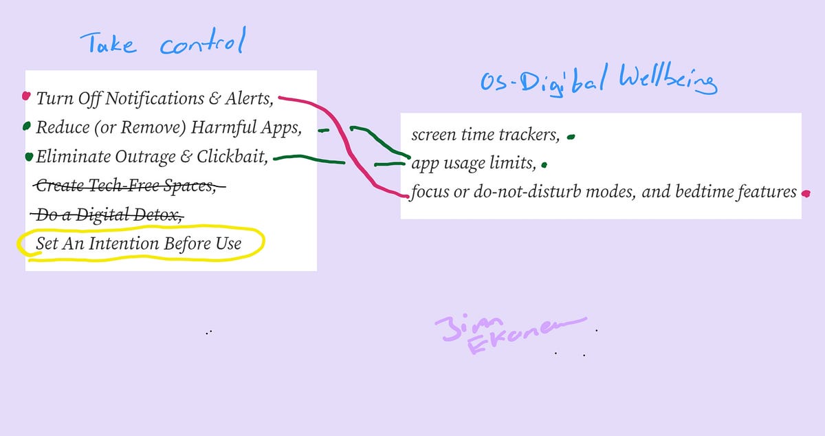
- With generous interpretation, app usage limits help with reducing harmful apps and eliminating outrage & clickbate. This can certainly be seen as a big responsibility for (social media) platforms, as they have faced court hearings before.
- Focus modes, DnD and bedtime features help users in an advanced way with turning off notifications and alerts. (I say advanced because there is some context sensitivity here. More on that another time..)
For users to be supported with ‘taking control’, the digital wellbeing tools should help with setting intentions.
As can be seen from the graphic, there’s 1 step that remains unaddressed:
Set Intentions →
Before using social media, take a moment to pause, be mindful, and set the intention for what you’d like to get out of the experience.
This can help get you into the right frame of mind for a healthier experience.
The user’s intention.
Don’t get me wrong, there will still be internal triggers like boredom, and the rest of the hooked model still applies, meaning the user’s intention could genuinly be ‘to open instagram’.
However, by addressing the user’s intention — their true need — design would be able tackle the problem before habits are formed. Thereby, unconcious engagement with the phone could be prevented at the operating system level.
Operating Systems as an entry point for change — again
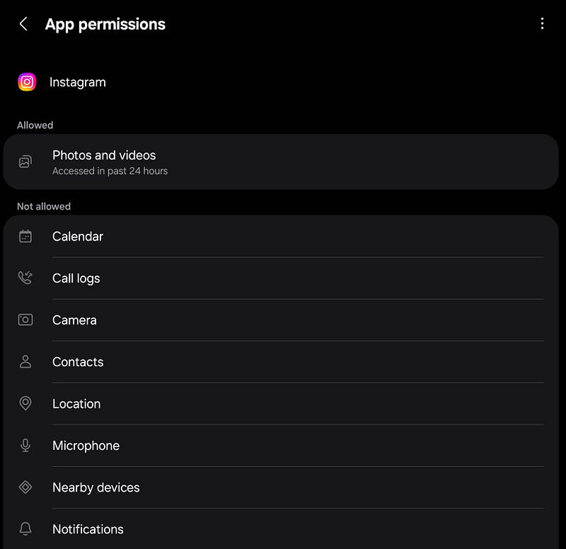
Looking at operating systems as a path to positive change for app-users, there is a quite recent example that illustrates the impact OS-design can have for the average consumer.
About 10 years ago, OS-design changed in favour of people’s privacy. This happened at the onset of GDPR and the legal pressure that came with it’s societal signifance.
Before then, apps could request a wide range of permission at install and users had little control. Today, Android and iOS act as gatekeepers who mediate access. This limits the data that developers and tech companies can collect.
With this history in mind, I pose the following question:
What if Android and iOS became stronger gatekeepers of mobile user’s wellbeing?
Fulfilling this call would come with great responsibility!
The status quo of notification restrictions and a dashboard of ‘hours spent’ is not enough to fill those shoes. Currently people still have to make decisions themselves when tired after work, and they have to know what the right decision is in alignment with their intention (e.g. to wind down).
Current operating system design repeatedly leads people towards a loss of control and self-regulation.
With that said, I’m ready to put my designer’s lense on again. Let’s evaluate the user experience design and see how it could be improved with AI!
Quick Design Theory: Object vs Task Orientation
Before we dive into the design of operating systems, I want to share some design theory about conceptual modeling. Johnson & Henderson are authors of the book ‘conceptual models’, the source of this piece of design theory.
Conceptual Modeling Basics
Concepts are the frame of an interactive system
Each user interface consits of concepts and presentations. The concepts are the underlying model that scope a system. Their design should be informed by research and take place before the presentation layer. Concepts roughly consists of:
- objects, &their attributes (e.g. apps, icons/battery, state)
- operations (e.g. open/uninstall/read)
- information hierarchy (heading/paragraph)
- interaction maps (defining available sequences of interactions).
Concepts are intangible. What users see are the presentations, the visual look and feel in a prototype or in a product.
Next to conceptual models on the system side, there are mental models that live in the user’s mind. They consist of assumptions and interpretations of the system state based on perception, prejudice, knowledge and culture.
The goal of any well designed interface is for the conceptual model to be as close to the user’s mental model as possible.
Conceptual Modeling Advanced
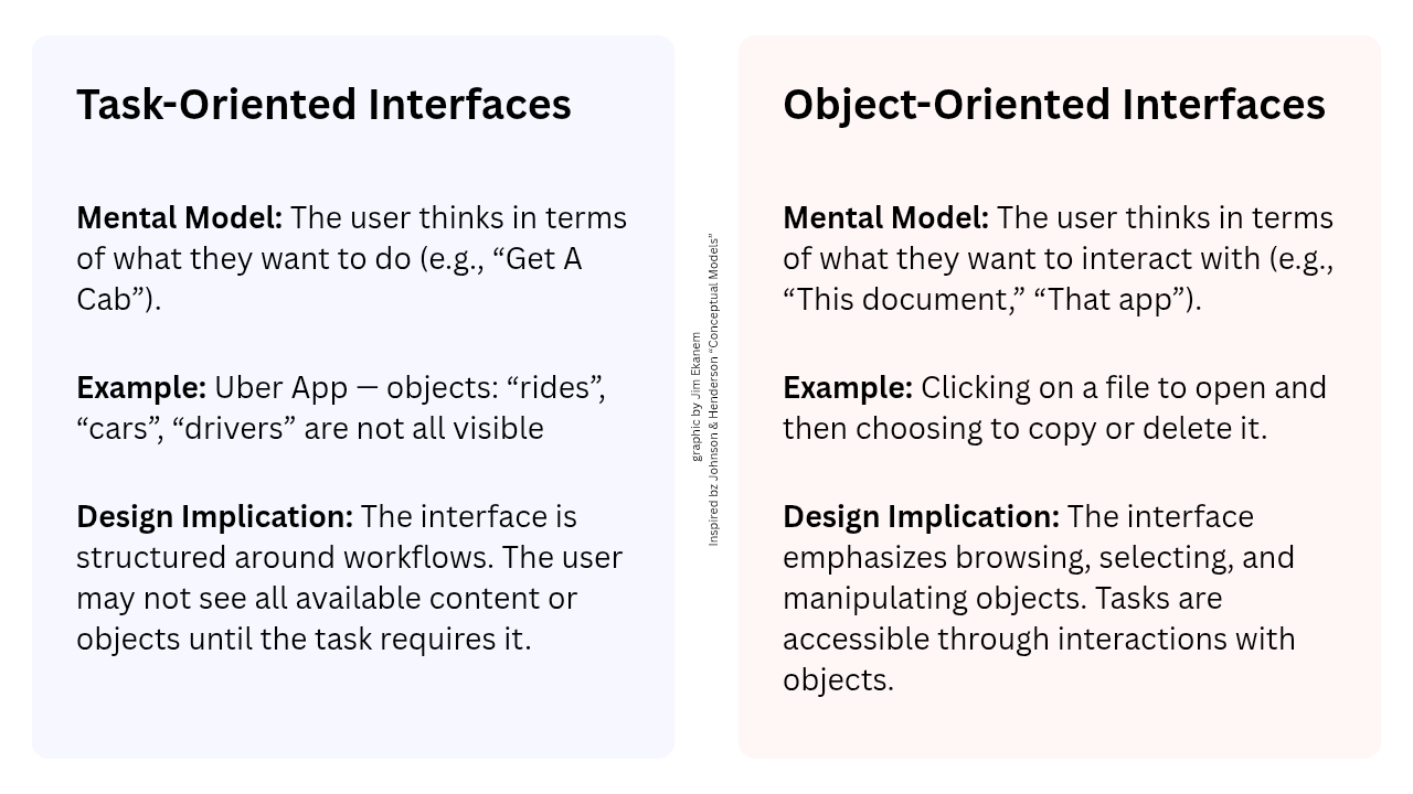
-> Task vs Object Orientation in interface design
Let’s remember, concepts are the scope of a system. According to the conceptual design framework the fidelity of the design increases with each step.
From defining the concepts there are two ways of proceeding towards the final presentation design:
Designers can either choose to structure the interface around objects or around tasks depending on the insights from research.
If users naturally think about what they want to do, task-orientation might be a better fit.
If users gravitate toward managing or exploring things, object-orientation usually feels more intuitive.
Today, most interactive system’s design is object-oriented.
Further reading on mental models (NNgroup)
Further watching on conceptual modeling (Stanford Lecture)
Summary so far
Operating System design is not conducive
…and a lot speaks for task-orientation!
When relating task-oriented interfaces to the earlier findings on digital wellbeing, there are several benefits that emerge by design.
- Hiding content (apps/icons) until a task requires it.
- Discourage browsing (unconscious scrolling).
- Structuring an operating system’s interface around workflows could better with a user’s mental model by considering their intention as opposed to their triggers — as is recommended by the center for humane technology.
With an emerging future in mind where users feel in more control during smartphone interaction, let’s look at what makes current OS-design object-oriented and what task-oriented alternatives could look like.
What a task-oriented AI interface could look like
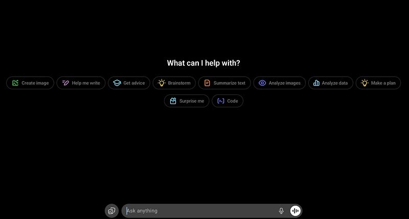
The screenshot of ChatGPT shows a task-oriented interface that mostly focuses on productivity, desk-work tasks. Even though its use-case and context are very different from that of a smartphone for leisure, this example provides a clear visual distinction to the object-oriented UI you would see if you unlock your phone or tablet.
To inform the contents of the tasks represented in a new OS’ UI it would be necessary to conduct research with regards to the user’s intention and most common activities whenever they decide to be in “focus mode”.
With the support of AI an adaptive, continuously learning interface could perform advanced research on the fly, being supported in its ability to provide great UX by enabling a certain degree of customization by the user.
Why task-orientation could succeed in terms of adoption:
Jakob’s Law for web-design says:
Users spend most of their time on other sites. This means that users prefer your site to work the same way as all the other sites they already know.
This means that a new interface design is more likely to succeed if it is similar to a commonly used one. An example from the online shopping domain would be that all checkout experiences are similar to Amazon’s or vice verca — for a reason.
Without scientific evidence, I think we can safely assume that ChatGPT is becoming quite popular in the general “smartphone-using” population for work tasks, holiday planning and more. More recently, AI assistants have been embedded into the latest mobile operating systems by default.
In that case, the same group of people that uses both technologies regularly would already know how to interact with a task oriented operating system design.
By leveraging existing mental models, we can create superior user experiences in which the users can focus on their tasks rather than on learning new models
- (lawsofux.com)
A blended UI for intentional exploration
If we were to look at a task-orientated interface as the “focus mode of the future”, then we would need an interface that can also be “normal” and explorative.
Ideally both at the same time.
Because let’s face it, exploration can be fun and inspiring. Getting lost in loosing control is not always a bad thing — but we must be able to return to ourselves, and feel the agency we have over how we interact with our tools.
Futuristic Prototype: Watch the short film on my artist-channel
How object-oriented interfaces can better support wellbeing today
Dumb phones to disconnect
These phones are perfect for a digital-detox lifestyle. They do not have internet yet come with a touch screen. This makes them excellent at removing a lot of distractions and preventing browsing behaviour. However, this also disables modern ways of communicating via messenges and calls which have long become generic through online platforms like whatsapp, telegram, instagram or signal.
If you want to save on the hefty price tag of a dumb phone, you can just get a smartphone without a sim card or buy a nostalgic Nokia.
Or you can mod your current device…
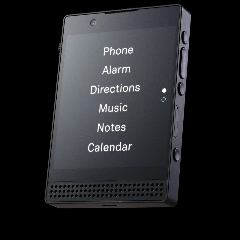
Minimal Launcher Apps change your smartphone’s interface
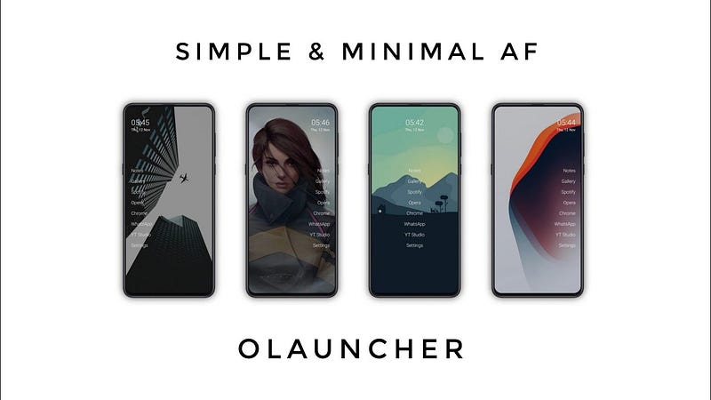
Installing a minimal launcher app almost turns your smartphone into a dumb phone without giving up internet access. The UI will start displaying text instead of icons which minimizes recognition as a trigger. This affects the impact on your memory, in particular activation through recency.
Overall, there are upsides and downsides to launcher apps when comparing them to dumb-phones and ultimately everyone has to decide for themselves what works best for their lifestyle and everyday needs.
Concluding the article
*UI = User Interface
If current, object-oriented operating system-UI’s are missing the forest for the trees, then task-orientation is like focusing on “another batch of trees”.
However, it is apparent that Android and iOS encourage browsing behaviour to a degree that the intentionally placed psychological hooks from product designers have a significant impact on user’s habits.
With more digital agency and thus control, we could strike a balance between the smartphone being a designated tool for growth and exploration, and the fact that people struggle with using it healthily.
There is a path to improve digital wellbeing by approaching the issue as a design problem.
AI assistants are becoming more widely adopted and mobile operating systems have already proven their gatekeeper abilities successfully when people’s privacy was being disregarded.
There is a path to improve digital wellbeing.
But we have to walk it!
Imagine a smart device as a tool that also supports people to:
Regain agency,
Savor attention,
& Make more space for intention.
With that being said, thank you for your attention.
- Jim Ekanem