Tuta’s Rebrand Disappoints
The world’s most secure email client Tutanota went through a rebranding recently. As a long time active user, former privacy enthusiast, aaand designer, I am very disappointed. Here’s why
Intro
Tutanota & Me
I love Tuta. My interest in privacy used to be very high which led me to create my account around 2017. I’ve been with them for years and during that time I passionatly incorporated other privacy focused interventions into my life, such as de-googling my smartphone or using a linux distribution alongsite windows by dual-booting.
As I started my business in 2022 I got several side jobs that require stable smartphone performance and popular google services, e.g. as a delivery driver. This led me to start seeing the issue of privacy as less important. Simultaneously to this change of needs, I was actively persuaded by the growing convenience of google & android services, and cross platform synching for calendar, emails and more. The latter was incredibly handy because I had limited freelance budget but wanted to hold my productivity and customer service to the highest standard possible.
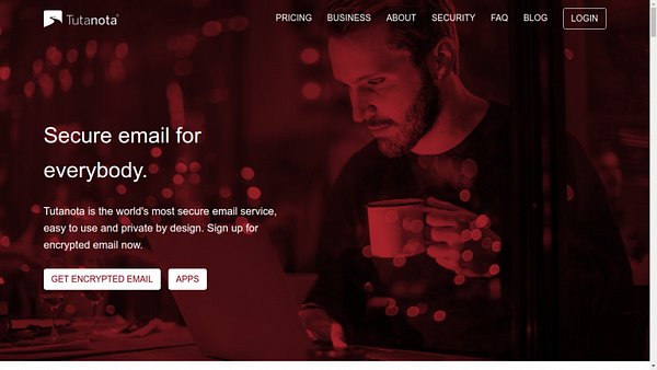
I still use Tuta as my main email and I feel secure and satisfied with their core email service. With the yearly contribution I always felt like I was making a difference and supporting online privacy. At the same time, I kind of developed into a fan of the service that I did not choose for convenience but rather that helped me make a sacrifice for a greater cause. A unique connection in the digital product space which for once does not rely on awe and senseless feature-rism.
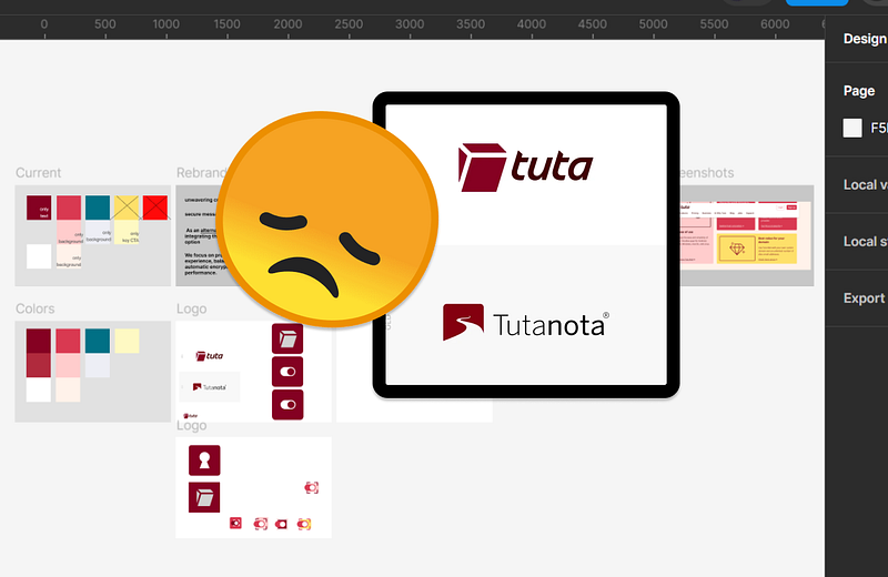
The rebrand
We focus on providing a seamless user experience, balancing high security and automatic encryption with usability and fast performance.
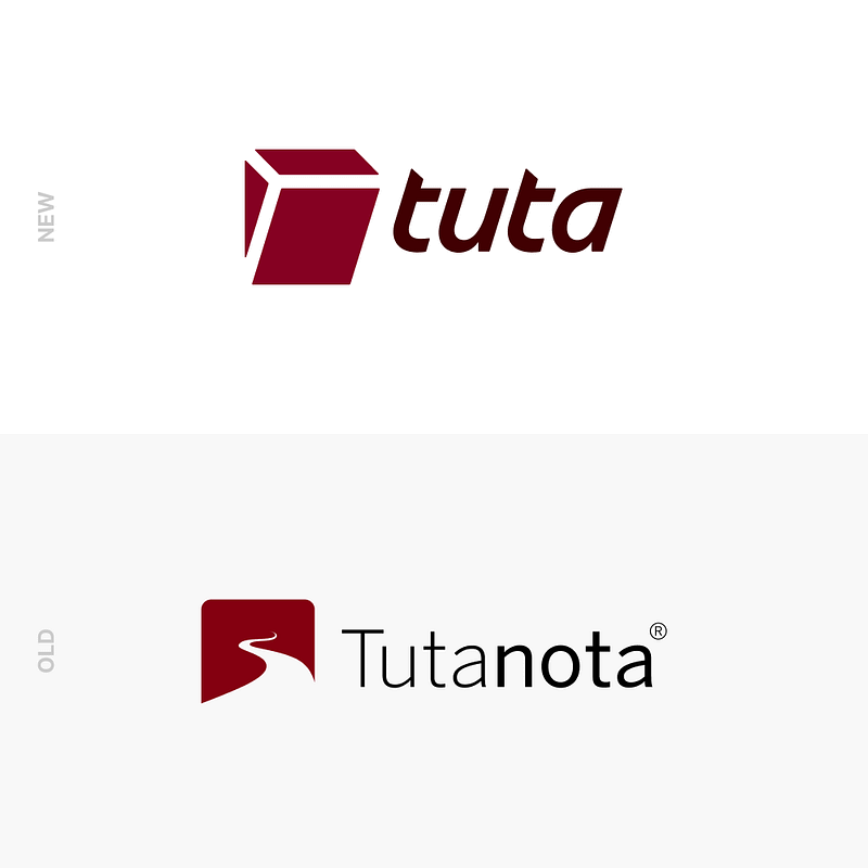
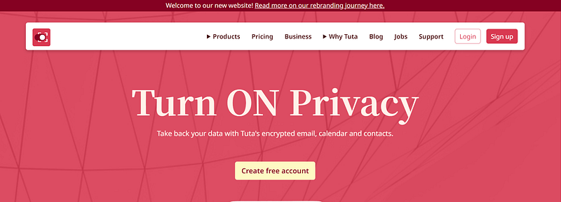
The new logo and additional colors
The new logo has a switch that symbolises how easy it is to “switch” privacy on. I personally find the metaphor interesting, however, the switch visual that was design lacks a connection to the digital realm. It seems like it is stuck in the 2000s and relating more to interior design of a house than to any intangible service solution in the cloud. Honestly, the font is super young and dynamic, the switch is super old and static — how does that go together?
Besides that, it seems like the new logo and the colors have been designed in different stages and not at the same time. The colors which, as part of the website were launched months after the logo seem to embody way more character than the logo. Let’s see what tuta says about this:
Meaning & Values behind the rebrand
In their blog post that covers the “rebrand journey” they mention several key phrases that the brand is supposed to represent
unwavering commitment to your privacy
As an alternative to these Big Tech offerings, integrating them into our service is simply not an option
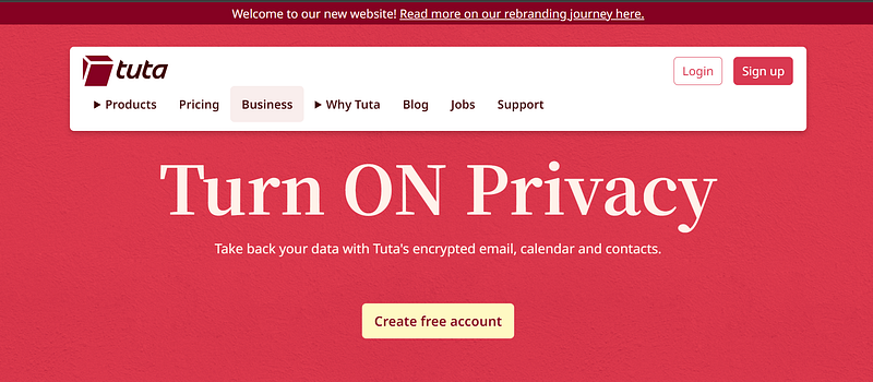
In that case, I find the newly added colors simply too vibrant, “trendy” and “unconcerned” with integrity. The brand should try not to resemble any other tech startup out there that runs a scalable cloud service and requires you to accept their cookies to read a blog post on their product documentation. Instead it should focus on less visual fuzz(or fuss) and keep contrasts a bit lower in practice.
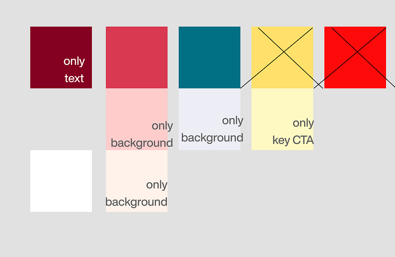
Next to the colors being very vibrant the palette simply does not harmonize with that many elements. The super vibrant red seems out of place! Even the dark red, which is a corner stone of their previous identity, seems to be pushed out by the bright yellow color.
My throughts and drafts
I think they could’ve done better. The old Tutanota looks more trustworthy and sure of it’s essence. The new Tuta looks unripe and all over the place in terms of colors — and that’s just the hero section and navbar, including their logo.
Whenever I voice my critique about something, I want to come up with suggestions for improvements as well. Mind you, I have no idea of their target group or the marketing & brand ID direction they want to take in the next 5 years- apart from the sparse blog post descriptions. In addition, I can’t spend a lot of time on coming up with well rounded and thoughout alternatives. As you might notice this blog post was also written in a draft mindset — The whole thing took me about 3 hours.
Now that I’ve given my disclaimers, here are my drafts on what to improve and which direction Tuta could’ve taken with their branding
Logos

The first logo I drafted suggests a brand that is simple, trustworthy. Tuta is not concerned with the flair of fancy visuals or catering to a unevangelized audience — in the sense of privacy
The second logo I drafted suggest a brand that is more dynamic and innovative than the current one. It also incorporates an artistic interpretation of privacy and colors that could cater to a new casual privacy aware audience — if they exist.
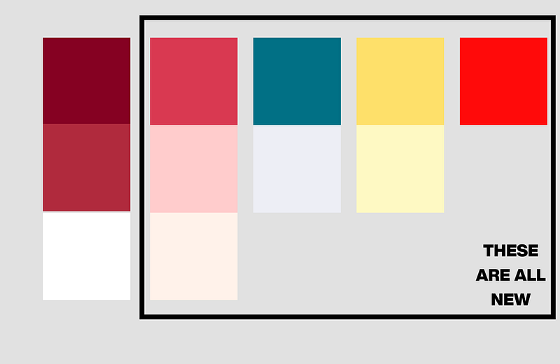
Colors
Regarding colors, I’d throw out the vibrant red and the vibrant yellow. This creates more harmony in combination and a more serious look & feel overall. I do love how the bright yellow looks on red as the primary call to action on their current website’s hero section… so I kept it.
Website & Accessibility
An alternative Hero Section
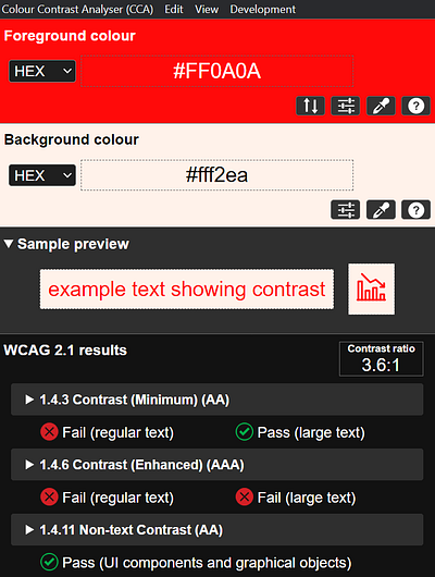
Color Accessibility concerns
Closing words
I’m aware that this post is not complete and of super high quality but it feels better than not speaking up at all given the knowledge, experience I have in the field of design, and the interest I have in good companies.
Curating all of this felt like a long winded, creative rant. I appreciate privacy even though I don’t care about it as much as I used to. I love companies with an ambitious mission and those that want protect entities with a lesser voice or in general want to make a positive change in the world. I hope Tuta’s branding team decides on what look they want to go for in a way that speaks to their business goals and target audience. Furthermore, I hope Tuta decides on which values to prioritize moving forward. Lastly, I hope they are not afraid to change their branding one more time.
Regards,
Jim
You can get in touch here: https://www.linkedin.com/in/jim-ekanem/